How to disable textarea resize, or allow only vertical
One CSS line turns the handle off. We dragged four textareas to check, then found the case where resize: none does nothing: a theme rule with !important.
The short answer. Add textarea { resize: none; } to your CSS to remove the resize handle, or resize: vertical to let people change only the height. In Tailwind the classes are resize-none and resize-y. If it doesn't work, a theme rule with !important is overriding yours. Before you turn resizing off, give the box enough height, or let it grow with field-sizing: content.
FormgongUpdated
How to disable textarea resize, or allow only vertical
Which CSS turns textarea resize off?
The resize property. Browsers give every textarea resize: both, which draws the small handle in the bottom-right corner. Four values cover everything you need: none, vertical, horizontal and both.
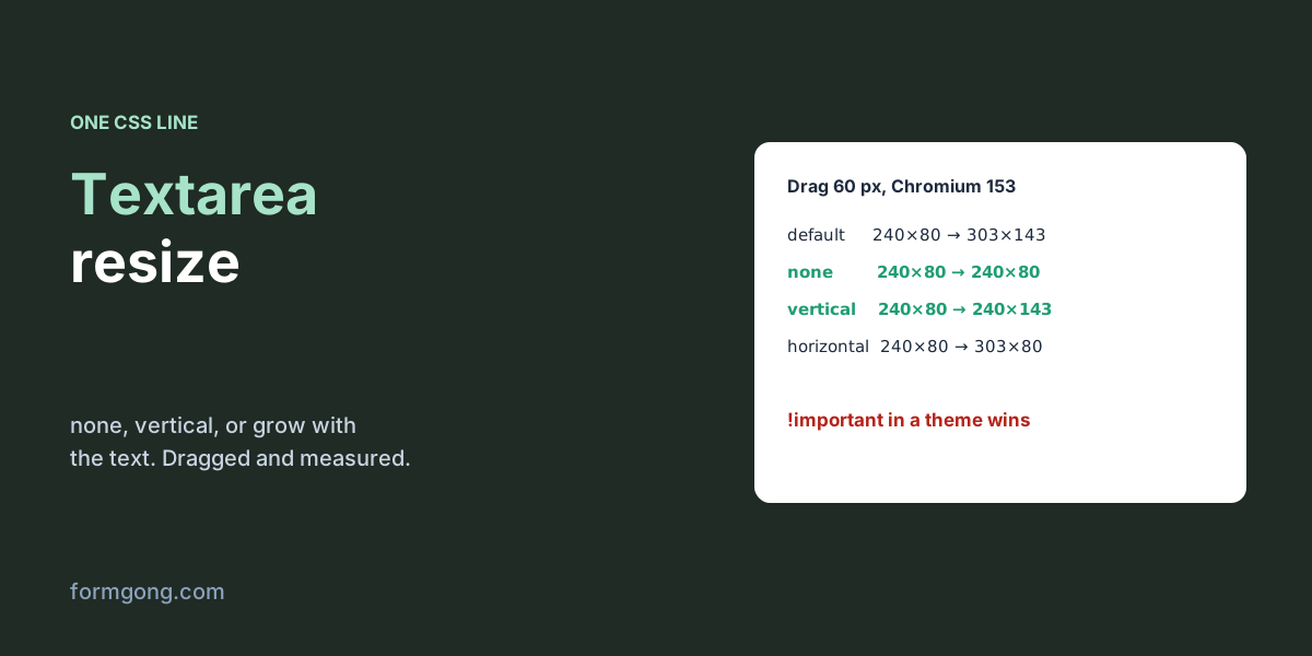
We put four textareas of the same size on a page and dragged the corner of each one in Chromium on 6 November 2026:
Chromium 153, 6 November 2026. Each textarea started at 240 × 80 px; we dragged its corner 60 px right and 60 px down.
CSS
Size after the drag
(nothing, the browser default)
240 × 80 → 303 × 143
resize: none
240 × 80, no change
resize: vertical
240 × 80 → 240 × 143
resize: horizontal
240 × 80 → 303 × 80
With none the handle disappeared and the drag did nothing. With vertical the width stayed at 240 px no matter how far we pulled sideways, which is usually the version you want in a form: the box can't break your layout, and people who write a lot can still make it taller.
There are also two newer values, block and inline. On an ordinary left-to-right page they behave like vertical and horizontal: in our test block grew only in height and inline only in width. They swap in vertical writing modes. MDN's compatibility data lists them from Chrome 118, Firefox 63 and Safari 16.
You don't need vendor prefixes. Some tutorials add -webkit-resize and -moz-resize “for older browsers”, but neither exists: Chromium's CSS.supports() returned false for both, and MDN lists no prefixed version in any browser. On phones the question mostly goes away. Safari on iPhone and Firefox for Android show no handle at all, whatever you set.
textarea.css
/* No resize handle at all */
textarea.fixed {
  resize: none;
}

/* Taller or shorter only, within limits (what we use on Formgong forms) */
textarea {
  resize: vertical;
  min-height: 96px;
  max-height: 400px;
}

/* Grow with the text instead of a handle (Chromium-based browsers) */
textarea.auto {
  field-sizing: content;  /* do not also set height */
  min-height: 60px;
  max-height: 160px;
  resize: none;
}
Tailwind, Bootstrap, React and plain JavaScript
In Tailwind CSS use resize-none, or resize-y for height only (resize-x is width only, resize is both). Bootstrap 5's base styles already set every textarea to resize: vertical (we checked bootstrap.css 5.3.3); add your own resize: none rule after it if you want the handle gone. In React or any JSX, pass it as a style: <textarea style={{ resize: "none" }} />, or put the rule in your stylesheet. All of these end up as the same CSS property.
To switch it at runtime, for example to lock the box after the message is sent, set textarea.style.resize = "none". In our test the corner stopped working as soon as the script ran. The property only blocks the visitor's drag: a script that set style.height on the same box still resized it to 200 px.
resize: none not working? Look for !important
If the handle is still there, open DevTools, select the textarea and look at the Computed tab for resize. Something else is winning.
The case that catches people is a theme or plugin stylesheet. In our test a stylesheet rule textarea { resize: vertical !important; } beat an inline style="resize: none" on the element, and the computed value stayed vertical. An inline style loses to !important from anywhere. Either add !important to your own rule with a more specific selector, such as #contact textarea, or remove the theme rule.
The other cause is putting the rule on the wrong element. Some page builders wrap the real textarea in a div that looks like a box, so resize: none on the wrapper changes nothing. Make sure the selector matches the <textarea> itself.
The opposite problem, resize doing nothing on a div you want to make resizable, has a different cause. The property only works when overflow is something other than visible. A div with resize: both did not move in our test; the same div with overflow: auto grew from 240 × 80 to 303 × 143. A textarea doesn't have this problem. Some guides warn that a CSS reset with overflow: visible removes a textarea's handle, but in Chromium the textarea's computed overflow stayed auto and the drag still worked.
rows and cols, or CSS height and width?
Both set the size, and CSS wins when you use both. A textarea with rows="4" cols="40" came out at 358 × 70 px in our test; adding width: 300px; height: 8rem changed the same element to 306 × 134. Keep rows in the HTML as a sensible starting height that works before your stylesheet loads, set the width in CSS (usually width: 100%), and use min-height rather than height if the box may grow. To limit how much people can type, use maxlength, not a small box.
Can the textarea grow with the text instead?
Yes, with field-sizing: content. The box starts at its min-height, grows as the visitor types and stops at max-height, after which it scrolls. In our test it went from 60 px empty to 106 px at five lines and stopped at 160 px, the maximum we set. It also shrinks back when text is deleted: a second box went from 40 to 86 px and back to 40. In Tailwind the class is field-sizing-content.
Support is recent. MDN's compatibility data in November 2026 lists Chrome and Edge 123, Safari 26.2 and Firefox 152, so older versions still in use won't grow the box.
One thing broke it: we first tried it with height: 80px on the same textarea, and the box stayed at exactly 80 px whatever we typed. A fixed height wins, so remove it and use min-height instead. Browsers that don't support field-sizing ignore the line and show an ordinary textarea, so set a sensible min-height either way.
If those visitors matter, add a few lines of JavaScript that run only where the property is missing. Setting the height to auto before reading scrollHeight is what lets the box shrink again. In our test this fallback took a two-row box from 36 px to 84 px at five lines and back to 36 px.
auto-grow fallback (JavaScript)
// For browsers without field-sizing: grow the box on every input.
const box = document.querySelector("textarea.auto");
if (!CSS.supports("field-sizing", "content")) {
  box.style.overflowY = "hidden";
  const grow = () => {
    box.style.height = "auto";                    // lets it shrink again
    box.style.height = box.scrollHeight + "px";
  };
  box.addEventListener("input", grow);
  grow();
}
Should you disable resizing at all?
For a message field in a contact form, usually not. Someone who zooms the page or uses large text may need a taller box to see what they wrote, and the handle is how they get it. resize: vertical protects your layout and keeps that option. Turn resizing off when the box sits in a tight space where any change of size breaks the design, and make it tall enough or self-growing when you do.
That is the split we use at Formgong. The textarea in forms we generate for you has resize: vertical and a minimum height of 96 px. The message box in our AI help chat has resize: none with a height between 40 and 120 px, because a resizable box inside a small chat window would push the send button out of view. If you need the other textarea details, what maxlength counts and how line breaks are sent, see our HTML textarea guide.
Whatever the box looks like, the text in it reaches you the same way. A form posted to Formgong keeps the line breaks in your email notification, and the same account can add a help chat and a reviews widget to the site.
Did a textarea still resize for you?
If a page builder, theme or browser kept the handle after you set resize: none, tell us which one at support@formgong.com. We will check it and add the fix here.
Frequently asked questions
How do I disable textarea resize in CSS?
Use textarea { resize: none; }. To allow only vertical resizing, use resize: vertical.
How do I disable textarea resize in Tailwind?
Add the class resize-none. For height only, use resize-y.
Why is resize: none not working?
Another rule wins, most often a theme rule with !important, which beats even an inline style. Check the computed resize value in DevTools.
How do I make a textarea grow with its content?
Use field-sizing: content with a min-height and max-height, and no fixed height. It works in Chrome and Edge 123+, Safari 26.2+ and Firefox 152+; for older browsers set the height to scrollHeight on input.