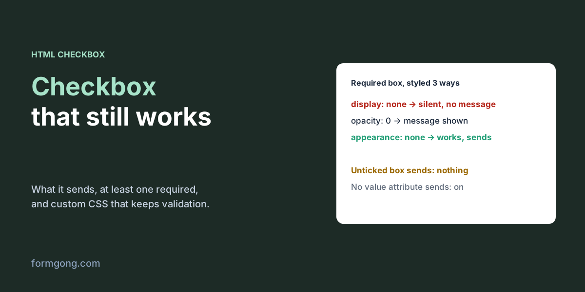
What does an HTML checkbox send?
Only something when it is ticked. On 6 November 2026 we posted a few checkboxes from Chromium 153 to a local server and recorded the request body:
| Checkbox | Sent |
|---|---|
Ticked, value="agreed" | terms=agreed |
Ticked, no value | plain=on |
| Not ticked | Nothing, the name is missing |
Ticked but disabled | Nothing |
indeterminate set by script | Nothing (it is not ticked) |
Hidden value="no" + box ticked, same name | newsletter=no&newsletter=yes |
The missing name is the part people trip over. Your server can't tell “unticked” from “this field was never on the form”, because neither arrives. Treat a missing checkbox as no. A disabled box is left out even when ticked, and so is one in the half-ticked indeterminate state, which is only a look; it is not ticked.
The old workaround is a hidden input with the same name and the value no in front of the box. When the box is ticked, both are sent: newsletter=no&newsletter=yes. PHP keeps the last one (PHP 8.3 parsed that body as newsletter => yes), so it works there. Other backends keep both. Formgong, for example, joins repeated names with a comma, so your inbox would show “no, yes”. Unless your backend is PHP, skip the trick and read a missing name as no.
If you do use it, the hidden input has to come first. With the hidden input after the box, the ticked form sent newsletter=yes&newsletter=no, and a “last value wins” backend reads that as no every time. If you send the form with fetch, there is a cleaner way: build the FormData and call data.set("newsletter", box.checked ? box.value : "no"). In our test the unticked box then arrived as newsletter=no. Don't use set() on a group that shares one name, because it replaces all the values with one.
When people must answer either way, a pair of radio buttons is clearer than a checkbox: “Yes” and “No” with the same name and required on one of them. The empty form was blocked with “Please select one of these options.”, and after we picked No it sent newsletter=no.
In JavaScript, read box.checked. After we clicked a box, checked was true, while getAttribute("checked") was still null and defaultChecked still false: the attribute only sets the starting state. box.value stayed "yes" as well, because it is what gets sent, not whether the box is ticked. In React that means e.target.checked, not e.target.value.
How do you make a checkbox required?
Add required. That is all a terms or consent box needs. When we sent the form with the box empty, Chromium stopped it and showed “Please check this box if you want to proceed.” next to the box.
Two things to decide. Should it be required at all? A box that has to be ticked is not a choice, so don't use one for newsletter consent, which has to be freely given in the EU. And the message comes from the browser in the visitor's language; if you want your own wording, set it with setCustomValidity() as in the next section.
How do you require at least one checkbox in a group?
Not with required. We put it on all three boxes of a topic group and ticked one. The browser still refused, because the other two were each required too: two error messages, one per unticked box. HTML has no attribute for “one of these”.
A few lines of JavaScript fix it. On every change, check whether any box in the group is ticked and put a custom message on the first box if none is. The browser then treats the group like any other field: in our test it blocked the empty form with “Pick at least one topic.” and, after we ticked Support, sent topic=support. Keep the group in a <fieldset> with a <legend>, so a screen reader announces the question with each option; our fieldset article explains why.
The same few lines handle “pick one to three”: count the ticked boxes and choose the message from the count. Our version said “Pick at least one topic.” with none and “Pick no more than 3.” with four, and sent topic=a&topic=b with two. Run the check when the page loads too, or an untouched group starts out valid. If you send the form from a click handler instead of the submit event, nothing validates it for you: call form.reportValidity() first, which returned false and showed the message.
We styled our error text with fieldset:has(:user-invalid). When the page loaded the selector didn't match. After one click on Send it did, and the hidden message appeared. With aria-describedby on the fieldset pointing at that message, Chromium's accessibility tree gave the group the description “Pick one to three topics.” MDN lists :user-invalid from Chrome 119, Firefox 88 and Safari 16.5.
<fieldset id="topics">
  <legend>What do you need help with?</legend>
  <label><input type="checkbox" name="topic" value="sales"> Sales</label>
  <label><input type="checkbox" name="topic" value="support"> Support</label>
  <label><input type="checkbox" name="topic" value="billing"> Billing</label>
</fieldset>

<script>
  const boxes = [...document.querySelectorAll("#topics input[type=checkbox]")];
  function checkTopics() {
    // The message goes on the first box; the browser shows it on submit.
    boxes[0].setCustomValidity(boxes.some((b) => b.checked) ? "" : "Pick at least one topic.");
  }
  boxes.forEach((b) => b.addEventListener("change", checkTopics));
  checkTopics();
</script>
How do you style a custom checkbox with CSS?
If you only want your brand colour, one line does it: accent-color: #1d4ed8. The box keeps its native look, focus ring and keyboard behaviour, and the browser picks the tick colour for contrast. With a dark blue accent our tick was white, with a yellow one it turned dark. Set width and height to make the box bigger; ours became 20 × 20 px. MDN's compatibility data lists accent-color from Chrome 93 and Firefox 92, and fully in Safari from 26.2 (partly from 15.4). In Tailwind it is accent-indigo-600 or any other accent- colour. The border, corner radius and tick shape stay the browser's.
For full control, style the input itself with appearance: none, then draw the box and the tick with CSS. Most custom checkbox tutorials do something else: they hide the real input and style a <span> next to it. How you hide it decides whether your form still works.
We tried three ways with a required, unticked box:
display: noneon the input: the form refused to send, and the visitor saw nothing at all, no message and no focus. The only trace was a red line in the console:An invalid form control with name='terms' is not focusable.The browser wanted to point at the box and couldn't, because a hidden element can't take focus. Keyboard users can't tick it either.visibility: hiddenfailed the same way, with the same console error.- Visually hidden (
position: absolute; opacity: 0and a 1 px size): the form was blocked with the normal message, so the browser could still reach the input. It works, but the message is attached to an invisible 1-pixel element. appearance: noneon the input: the box was focusable, the required message appeared on it, the Space key ticked it, and the form sentterms=yes. Nothing about the checkbox changed except how it looks.
The third is the one to use. The code below is the version we tested, with a visible focus ring for keyboard users. In Tailwind the same idea is appearance-none plus your own border and checked: classes on the input, with an icon in a sibling element shown through peer-checked:.
Draw the tick with a border, as below, not with a background. Windows high contrast mode replaces your colours with the system's, and we emulated it in Chromium: our border tick stayed visible, black on white, while a tick drawn as a white background with clip-path disappeared into the forced white box. Tailwind's docs suggest forced-colors:appearance-auto, which hands the box back to the browser in that mode.
Once the browser no longer draws the box, every state is yours to draw: :checked, :focus-visible, :disabled and :indeterminate, which matched in our test once a script set the property. A custom radio is the same pattern with border-radius: 50%; the arrow keys still move between options of the same name, and ArrowDown on our styled radios sent plan=pro. For accessibility, WCAG 2.2 asks for a pointer target of at least 24 × 24 CSS pixels (or enough space around a smaller one) and a 3:1 contrast for the box's border against the background. Wrapping the box and its text in a <label>, or using for, makes the text clickable too; both ticked the box in our test.
<label class="check">
  <input type="checkbox" name="terms" value="yes" required>
  I agree to the terms
</label>

<style>
  .check { display: inline-flex; align-items: center; gap: .5rem; cursor: pointer; }
  .check input {
    appearance: none;              /* removes the browser's box, keeps the input */
    width: 1.25rem; height: 1.25rem; margin: 0;
    border: 2px solid #555; border-radius: 4px;
    display: inline-grid; place-content: center;
  }
  .check input:checked { background: #1d4ed8; border-color: #1d4ed8; }
  .check input:checked::before {   /* the tick */
    content: ""; width: .6rem; height: .35rem;
    border: solid #fff; border-width: 0 0 2px 2px; transform: rotate(-45deg);
  }
  .check input:focus-visible { outline: 2px solid #1d4ed8; outline-offset: 2px; }
</style>
Toggle switches and “select all” boxes
A toggle switch is a checkbox drawn as a slider. Add role="switch" and Chromium's accessibility tree reported it as a switch instead of a checkbox, so assistive technology presents it as an on/off control. It sends exactly like a checkbox: notifications=on when on, nothing when off. Use a switch for a setting that takes effect at once, and a checkbox for a choice that is sent with the form.
A “select all” box shows a dash when only some of the boxes below it are ticked. That is the indeterminate state, and there is no HTML attribute for it: set box.indeterminate = true from JavaScript whenever some, but not all, are ticked. A click on it clears the dash and ticks the box, and as the table above shows, a box in that state sends nothing.
What should the server do with checkboxes?
Three rules cover it. A missing name means unticked. A name that appears several times is a list, so read all of the values: in JavaScript that is formData.getAll("topic"), as our FormData article shows. And anything the browser required, check again on the server, because a script or a bot can post without the box.
Formgong does the list part for you. Several ticked boxes with the same name arrive as one field, topic: sales, support, in your email, Telegram message and dashboard, and a JSON array sent with fetch is joined the same way. For the last rule, add a field check (Settings, then Protection, then Field checks) that marks terms as required. A post without the ticked box is then refused with a 422 before it reaches you. Our guide to input types lists what every other field sends.
The same account covers what comes after the form: an AI help chat for the questions people have before they tick “I agree”, and a reviews widget for the trust you need near that button.
Did a checkbox behave differently for you?
If your checkbox sent something we did not list, or a custom style broke in a browser we did not test, tell us at support@formgong.com. We will check it and add it here.
Frequently asked questions
What value does an unchecked checkbox send?
None. Its name is left out of the request entirely, so treat a missing name as unchecked.
What does a checkbox send without a value attribute?
The word on, for example newsletter=on, when it is ticked.
How do I require at least one checkbox in a group?
HTML has no attribute for it. Use JavaScript to call setCustomValidity on one box when none is ticked, and clear it when one is.
How do I change the color of a checkbox?
Use accent-color, for example accent-color: #1d4ed8. For your own border, radius or tick, use appearance: none and draw it with CSS.
Why does my required custom checkbox not show an error?
The real input is hidden with display: none, so the browser can't focus it. Chrome logs “An invalid form control … is not focusable.” Use appearance: none instead.
Sources and documentation
Official references for this guide: . HTML forms, where data is stored.